Wednesday, March 2, 2011

ASSIGNMENT 9: Drawing a Dummy

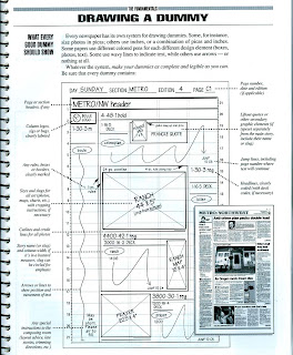
The next Assignment will incorporate your ability to identify the elements of a package with your ability to recreate the original on a mock or dummy blueprint.

This is like working backwards from a final product.

Here are two instructions/explanations from Basic Deign by Tim Harrower.
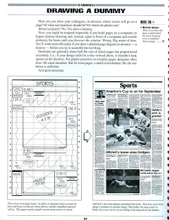


STEP ONE: You will need graph paper and a ruler.

STEP TWO: Pick a Design to Mock-Up. I've included many examples below; you can also find these and more in the newtowrk forlder.

STEP THREE: Using a Pencil, Decide on the Columns and layout of the Page and Start creating the Dummy on One side of the Graph Paper.

STEP FOUR: Remember. Use Xed Boxes for art, Squiggles for Body Copy, and Only One or Two words to indicate headlines.

STEP FIVE: Label at least 8 elements on your dummy.

STEP SIX Turn in a Print Out of the Original Side by Side of the Dummy.

Step One
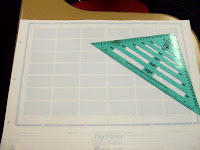

Step Two Step ThreeStep Four & Five Step Six

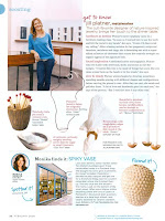
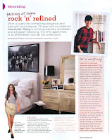
HERE ARE SOME MAGAZINE PAGES YOU COULD USE FOR YOUR OWN DUMMY


Wednesday, February 23, 2011

ASSIGNMENT 8: COLORIZATION


COOL STUDENT EXAMPLES

BEFORE AND AFTER


STEP BY STEP INSTRUCTIONS
HERE ARE THE URLs

PRINT THE CHECKLIST FROM THE FREEUSERAREA FOLDER ASSIGNMENT 8


Tuesday, February 15, 2011

ASSIGNMENT 7 LEARNING PHOTOSHOP

ASSIGNMENT 7
PHOTOSHOP: BASIC ADJUSTMENTS
CHECKLIST

10 pts _____ Step 1: START with 4 images that are from your own collections. Create a folder called Assignment 7 and put these in the file.

These can be taken on a digital camera or camera phone. They should not be professional images or images borrowed from the internet.
You can send them to yourself on email or download them directly from the device or transfer them using a memory device.

0 pts _____ Step 2: Using the Assignment 7 POST of the Desktop Instructions blog, you will watch or read the TUTORIALS for:

LEVELS, CURVES, CLONE STAMP & HEAL BRUSH,
CUTOUTS FrOM BACKGROUNDS


40 pts _____ Step 3: PERFORM each task to a different picture. You will save the 4 pictures as originals and as fixed images.

WHEN YOU FIRST OPEN THE FILE *******SAVE AS******* and label a new copy of the image with the NAME OF THE TECHNIQUE included in its title.

Example: “Roberson_LEVELS_before”, “Roberson_LEVELS_after”

POINTS ARE AWARDED BASED ON THE QUALITY OF THE ADJUSTMENT


20 pts _____ Step 4: PROPER file types are required.
As you work in Photoshop, remember the file types are critical and you can have multiple file types with the same name

The Original SHOULD be a .JPG.
The Working Image MAY be a .PSD
The Final image MUST be a .JPG

FINAL CHECKLIST
45 pts ______ STEP 6: Publish the Final Document
_____ (20) Post the ALL 8 JPEGs to BLOGGER in a NEW POST TITLED ‘Assignment 7” and each is labeled with the name of the adjustment and “before” or “after”
_____ (10) Email the .final JPEGs to droberson@hsd2.org
_____ (15) Print in COLOR 3x5 proofs using WINDOWS PICTURE AND FAX VIEWER
You need to Learn

LEVELS

YOUTUBE VIDEO

WEBSITE TUTORIAL

ClONE, STAMP OR HEALING

YOUTUBE VIDEO

WEBSITE TUTORIAL

CURVES

YOUTUBE VIDEO

WEBSITE TUTORIAL

CUT OUTS w/ Filters & Lasso Tool

YOUTUBE VIDEO (using FILTER>>EXTRACT)

WEBSITE TUTORIAL (using LASSO Tool)

I've embedded certain tutorials that should help you along the way.

THE RAW EADVANCED (this is for students who have completed Basic Photography and want to enhance their photography ability with Photoshop)

YOUTUBE VIDEO

ASSIGNMENT 6


10 pts _____ Step 1: Open an existing document that you have created in WORD and save it as “yourlastname-assignment6-date(or draft)” and save in your own ASSIGNMENT 6 folder


* The paper should be any WORD document and be at least 300 words long.

10 pts _____ Step 2: Choose 2-4 fonts that you will use for this assignment. (

* Font choice: _____________________ * Font choice: _____________________

* Font choice: _____________________ * Font choice: _____________________

0 pts _____ Step 3: SET the page to Narrow Margins
* Narrow margins .25 or .5

50 pts _____ Step 4: Create FINAL LAYOUT.
Minimum Requirements:
►) CLEVER Title (in txt bx)is a complete Headline Package with Primary and Secondary ►) Author in Text Box ►) 2 Images
►) Use at least 1 Effect ►) Limit colors to Black/White (gray tints)
►) Use a consistent leading ►) Use at least 3 different Point Sizes
►) Use a variety of typography technique ►) Limited to 1 sgl page
*

25 pts _____ Step 5: Save as PDF and convert to JPEG

FINAL CHECKLIST
15 pts ______ STEP 6: Publish the Final Document
_____ Post the JPEG to BLOGGER in a NEW POST TITLED ‘Assignment 6”
_____ Email the PDF to droberson@hsd2.org
_____ Print the final and turn in with checklist

10 Pts _____ STEP 7: BLOGGER COMMENTS
First Person comments ______________________
Second Person comments ______________________


Friday, January 28, 2011

Linking Versus Embedding

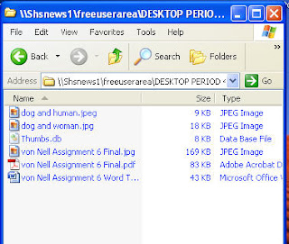
Here is an image that is 228 KB


When you INSERT of PLACE an Image in a Layout using Desktop Publishing software like Word 2007, InDesign or Blogger, you are asking the program to create a link between the image on the layout that appears on the screen and the image file that exists somewhere else, probably on a server or desktop hardrive. We call this LINKING and it is similar to a LINK that jumps you from one webpage to another, only this kind of LINK just remembers the information from the image and recreates that information on your layout. Since the image still remains intact in the folder, the link allows the layout document to remain small.


When you COPY AND PASTE and image, the information from that image, its code if you will, is embedded in the layout document. Because the code exists in the document itself, the layout document has to take up more space to remember all the information. And the larger a layout document gets, the slower it moves.


This is an example of using the INSERT button in Word 2007


The result is a file that is big, but not huge


But when the Image is COPY and PASTED into the Word document, look at the file size

Layout in Word 2007

The following slideshow and demonstration will help you to use Word 2007 more creatively as you begin to put real content onto your improved essay for ASSIGNMENT 6

Sunday, January 16, 2011

ASSIGNMENT 5: QUOTE TYPOGRAPHY ON WORD


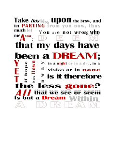
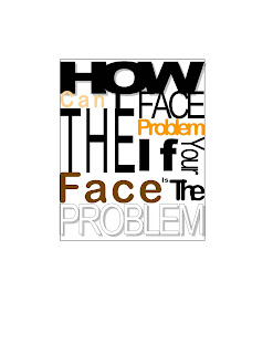
NOW you are going to create a TYPGRAPHICAL package of a famous quote using Microsoft Word 2007.

The objective of Assignment 5 is to Introduce you to the qualities of TYPOGRAPHY and basic TYPOGRAPHY philosophy, while also introducing you to the specific tools availabale for TYPOGRAPHICAL manipulation in basic DESKTOP software like WORD 2007.

You will:

STEP ONE: FIND a Famous QUOTE and copy it into WORD

STEP TWO: Choose the font(s) that you will use for the assignment. You can use the basic font families that are suggested in the FLASH SLIDESHOW on Font Families.

STEP THREE: Create a SPACE for your PACKAGE and separate the quotes into a number of parts, each in it's own text box. This space MUST BE SQUARE or RECTANGULAR. It should be the size of a small Bumper Sticker.

STEP FOUR: Use the typographic adjustments available in the Microsoft WORD 2007 Fonts selections and create typography that enhances the quotation and fills the package.

STEP FIVE: Your will save the file TWICE. Once will be fore the printed and emailed PDF/JPEg. THis is the clean and final version. The second saved file will ned to be labeled with the typographical adjustments that you have made.

HERE IS THE REQUIREMENTS AND CHECKLIST with an EXAMPLE of STEP 5
STUDENT EXAMPLES
HERE IS THE SLIDE SHOW THAT EXPLAINS HOW TO DO THE WORD TECHNIQUES